
While on vacation at Disney World this past week, I noticed that many of their road signs are difficult to read. I think whitespace had a lot to do with that. Let’s look at some of the problems and make an exercise out of fixing them.
Whitespace is an important element in design. It helps establish visual hierarchy, helps your eye distinguish the different elements.
Disney’s road signs don’t have very consistent whitespace.
Some signs have only a few lines of text and there is plenty of space between them.

Other ones have too many items, or items that each span multiple lines. They try to cram too many items on each sign by reducing the space between lines.
This made it hard to quickly scan the signs, because I always had to take a second to adjust to the line spacing.
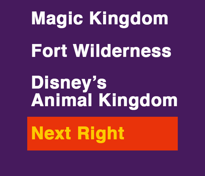
I wanted to take a stab at redesigning one of these signs. For the exercise I chose an especially bad example from a t-shirt design on Google Images and recreated it in Photoshop:
 Confusing to read. Quiz: How many distinct items are there?
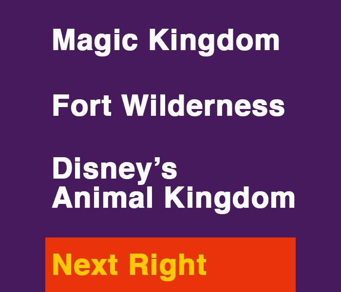
My first attempt was to space out the items, and tighten up the line height within each item. This one is already a lot more readable, I think. I also tried out the idea of using all the available vertical space. For the 3rd pass, I separated the items from the “Next Right” banner at the bottom:
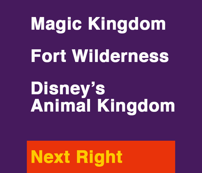
Which one do you like best? Want to try your hand at making your own version? Grab the PSD of the original version here and leave a comment with your design!