You may find that it’s difficult to choose colors that look great together. You might’ve even tried using one of the online color picker tools to help, but it was still hard to get good colors out of it.
Today I’m going to talk about the color wheel, how it works, and how to make the most of some helpful color picker tools to choose a great palette of colors that look nice together.
The Color Wheel
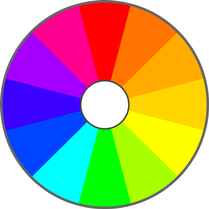
It all starts here. The color wheel is a very simple concept with a lot that can be extracted from it.

You might notice that it’s a circle. You’d be correct! You might also remember from geometry class that a circle can be divided into 360 degrees. The hues shown here are evenly spaced, 30 degrees apart. Let’s take a step back and talk about “hue” for a second.
Hue
A color can be defined in many different ways, but here we’ll talk about Hue, Saturation, and Value. You might also see this abbreviated HSV (or HSB, where the B is for Brightness).
“Hue” is just a fancy word for “color.” You could also get mathematical and say hue is the number of degrees you travel around the color wheel. At 0 degrees, you have red. At 180 degrees, there’s green. So hue is a number between 0 and 360 that defines where you are on the color wheel, and it defines your “basic color”. From there, the basic color can be altered by…
Saturation
The saturation of a color defines how strong it looks. This only really makes sense after we’ve already chosen a hue. It’s a percentage of the hue. Here’s the full saturation range for hue 0, also know as red:
 Range of Red Hues
So a high saturation means you get the full color (bright red, in this case). A lower saturation will give you a faint red. 0 saturation is white.
Ok, there’s one more term and then we’ll get back to the color wheel. That one is …
Value (or Brightness)
These terms are used interchangably, and I like Brightness a little better because it’s more descriptive. Fully bright means you see the full color. It’s a percentage (like Saturation is). A value of 100% = solid hue (if saturation is at full, anyway). 0 brightness is black, which makes some sense if you think about it. If you turn the light off in your room, it’s black, right? No brightness.
 Range of Red Values (Brightnesses)
Back to the color wheel
Ok, so how does all of this apply to the color wheel?
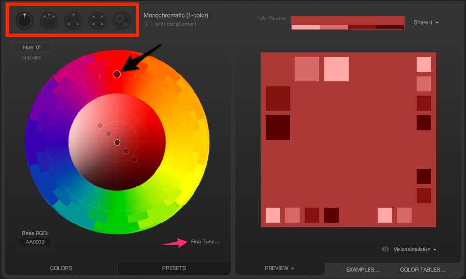
Well, the one I drew is pretty basic. It just has hues, and not many of them, at that. There’s no variation in saturation or brightness. For a nice color wheel suitable for actually doing things, check out Paletton. There are other tools like this, for example Adobe Kuler and ColourLOVERS, but I’ll just focus on Paletton for now. It looks like this:

Visit the site and try playing around with it. Here are a few things to take note of:
- The selector up top lets you choose the type of palette and how many colors you can work with.
- Even though you choose 1, 3, or 4 colors, you’ll see that you can choose many different variations within each color (saturation/value). They still work well together because they’re the same hue.
- Hover over one of the color squares to the right to see its RGB value, great for pasting into your CSS.
- The circle up top (pointed to by the black arrow) is the hue selector. Drag it around to pick a different hue.
- You can also pick hues by clicking inside one of the outer rings of solid color, the ones that look like Tetris pieces.
- The little circles in the middle can be dragged around to change the saturation and value/brightness simultaneously.
- X axis is Saturation (left/right)
- Y axis is Value/Brightness (up/down)
- By changing the Saturation + Value of the base color, you get 4 other similar colors (those 4 other circles in the middle).
- Try out the Fine Tune button, which lets you change values by small increments and also shows you how the color wheel is affected by each of them (watch the circles move).
As a side note: would a video of using Paletton be useful? Should I include a video and text, or just one of them? Let me know in the comments.
Practice
Go to Paletton and build a few color palettes that look pleasing to you. Try all of the options at the top-left.
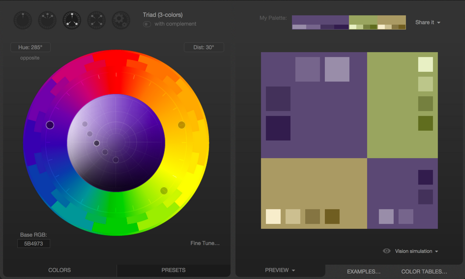
Remember, you don’t have to use the full hue for every color. Let’s say you picked hue 285, for instance. It would look like this:

From this page, these are just a few of the palettes that you could come up with:
So go try creating a few different palettes and get a feel for what works. Paletton also has a handy Examples section (bottom right) that lets you preview the colors in a pseudo-web-page.
Happy color picking!
